Q Care brand positioning and website by Schwung
From brand research
to a brand that rings true.

Back to the core of a care brand.
we|are for everyone
– The slogan that emerged from the brand work
Since 2001, family business Q Care has been the national expert in total wound and pressure-ulcer care. A wonderful company with the ambition to make that care better, more affordable and more accessible. The question to Schwung: help us sharpen our brand and bring it online.
We did not start with the form, but with the substance. In a programme of brand sessions we worked together on the brand foundation: from brand research and brand architecture, via bold ideal and Golden Circle, to proposition, promise and slogan. Only then came the visual identity, the new website and the rollout across all brand assets.
One brand that speaks to a whole care chain.
The care sector is a special one when it comes to brand and communication. You are dealing with a whole chain: from clients and informal carers to referrers, care professionals, purchasers and insurers. All with their own language and their own interest. On top of that came a brand question: the existing set-up resembled an endorsement brand, with three separate propositions and three pay-offs of their own. The question was whether that still fitted Q Care's ambition. Our brief: bring the brand back to one clear core that rings true for everyone in that chain, and carry that core through into a new website.
The brand built up in layers.
We worked according to our DIY-branding method: in six steps, together with the core group, towards a solid brand foundation. Doing the brand work yourself increases involvement, and the brand really comes to life within the organisation.
Brand architecture
We started with research and feedback on the existing Golden Circle, core values and propositions. When we dug into the brand architecture, there was something to discover: three separate pay-offs were keeping the brand fragmented. We chose a branded house, one Q Care with one promise, with three clear labels underneath.
- Q Care Wound & pressure-ulcer care (main label)
- Q Care Service & Products (sub-label)
- Q Care Academy (sub-label)
- One why, one proposition, one promise
Bold ideal & Golden Circle
With the bold ideal (a BHAG) we made a leap into the future: where does Q Care want to be? From that energy we wrote out Sinek's Golden Circle, from the inside out. That brought the why to the surface: contributing to the optimal wellbeing of people through care.
- BHAG: the authority in (complex) wound care
- Why · how · what sharply formulated
- Archetype: the Hero
- Basis for mission, vision and corporate story
Proposition, promise & slogan
From the foundation came the proposition and the brand promise. And during the pay-off study, the find that brought everything together emerged: we|are. Wellbeing is what care is all about, and 'we are' makes it personal and involved. The orange stroke makes the difference visible.
- Proposition and brand promise written out
- Slogan: we|are for everyone
- Core values: committed, enterprising, respect
- Plus quality, the Q of Quality
Visual identity & website
The substance was given a form. A logo with the pay-off, a palette of deep blue and orange with light blue and green for the labels, and the Dosis typeface. We translated that same foundation into a new website: form, content and structure follow directly from the brand research, supported by keyword research for SEO.
- Logo, pay-off and brand manual
- Colour, typography and icon set
- New website: form, content & structure
- Top photography and B1-accessible language
Brand assets & lettering
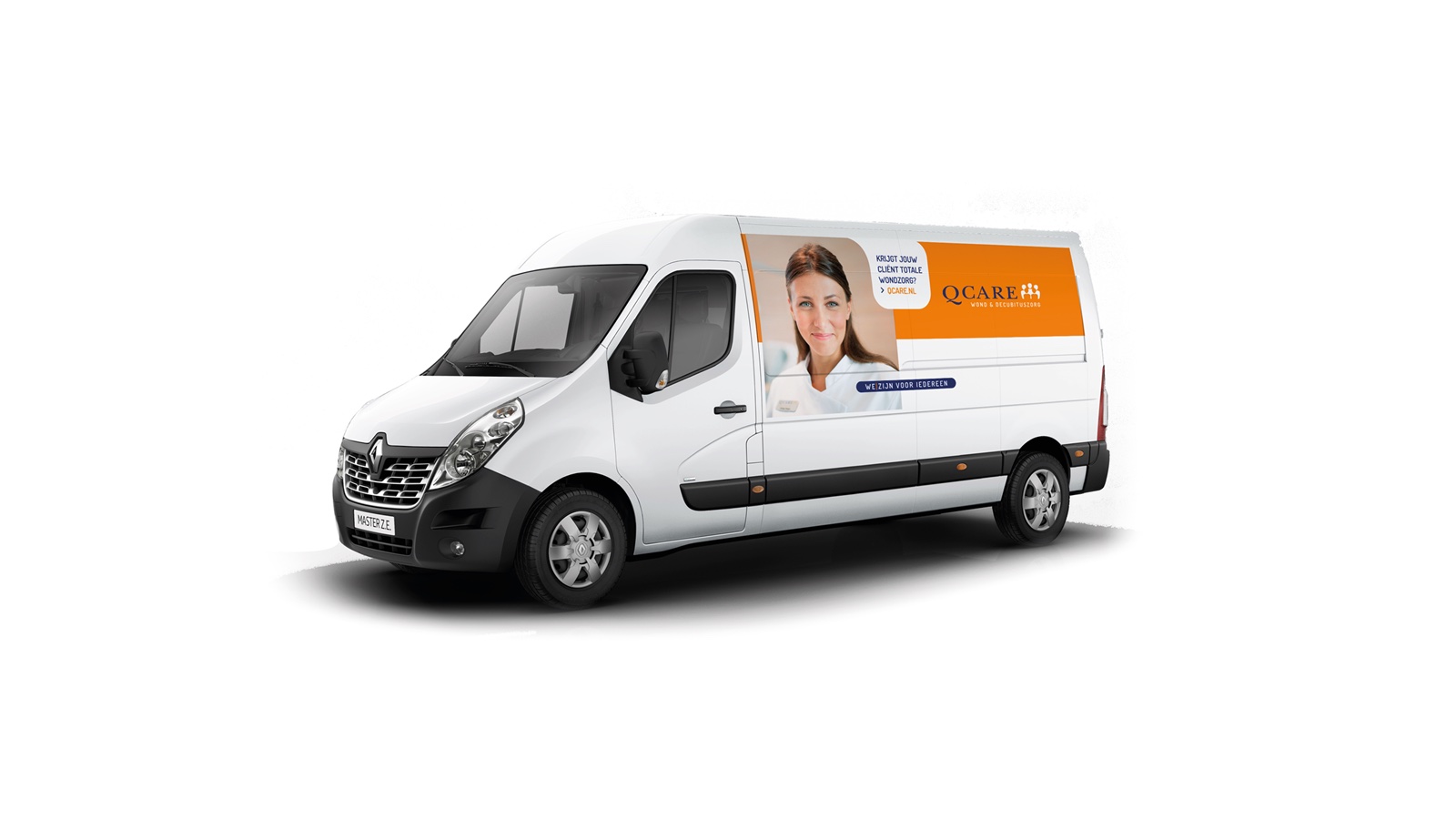
A brand only comes alive when you see it everywhere. We rolled the identity out across the brand assets: from vehicle lettering and print to social-media avatars. Consistent, recognisable and always with that same calm and the same face.
- Vehicle lettering
- Print and presentations
- Social-media avatars
- One consistent brand image
The Golden Circle, from the inside out.
Sinek's model forced choices. The result is a logical, compact brand description that forms the basis for everything Q Care says and does. Starting with the why.
Q Care contributes through care to the optimal wellbeing of people. Care for our fellow human beings is central to everything we do.
As enterprising specialists we develop knowledge, services and products, and share them with others. That is how we make high-quality care accessible to everyone.
Total wound and pressure-ulcer care for clients at home, in care institutions and in our own treatment centres. With tailored aids and services.
One stroke makes the difference.
we|arefor everyone
We look after the optimal wellbeing of people involved in the prevention and treatment of complex wounds. We do this by continually making care better, more affordable and more accessible, with attention for everyone.
Who is everyone?
"For everyone" must not be non-committal. So we made it concrete. We defined ten target groups across the entire care chain, and gave each a persona and a customer journey: a name, a face, and what that person needs. That way Q Care pivots its approach to the specific need, and contributes as much as possible to the wellbeing of each of them.
Clients
- ClientAt home
- ClientIn a care institution
- ClientIn a treatment centre
Informal care & professionals
- Informal carer
- Occupational therapist
- Care worker
- Community nurse
Stakeholders
- Purchaser
- Board of directors
- Insurer
For each persona we described how they prefer to be approached and what they need. The customer journey then maps the whole path a client, professional or stakeholder travels in their contact with Q Care, from orientation to aftercare.
The form to match the substance.
The look and feel: calm, simplicity and quality. We achieve that with plenty of white and colour space, full blocks of colour and sparing accents. Less is more, fitting for a brand that works with attention.
A calm, friendly typeface. We apply accents sparingly, mostly with an underline.
Imagery that shows 'well'being
The main images use a large depth of field: the subject sharp and strong in frame, the background calm and simple. We show people who feel good. Accessibility is a strategic pillar, in the language too: we write at B1 level as much as possible.
The brand, now online too.
On the basis of the preliminary research, the structure was easy to carry through into the website. Form, content and structure follow directly from the brand foundation. Brand, content, technology and SEO: every aspect at top level, including the photography.
qcare.nl · desktop

In practice · at the bedside
Taking the brand onto the street.
From screen to street. We rolled the identity out across the brand assets, with the vehicle lettering as the most visible calling card. That same calm, the same face and always the pay-off: we|are for everyone.
Role, client, live.
Client
Q Care wound & pressure-ulcer care
Role
Brand research, positioning, visual identity & website
Together with
Copywriters, SEO, web builders, photographer & Liesbeth Rutten
Live
Frequently asked questions about the Q Care case
What did Schwung do for Q Care?
We guided Q Care from brand research to a complete brand foundation and its rollout. In a programme of brand sessions (DIY branding) we determined the brand architecture, the bold ideal and the Golden Circle together. From that followed the proposition, the brand promise, the core values and the slogan. We then translated all of that into a new visual identity, a brand manual, a new website (form, content and structure) and the rollout across brand assets and lettering.
What was there to discover in the brand research?
The existing structure resembled an endorsement brand: one brand with three separate propositions and three pay-offs of their own. When we dug into the brand architecture, that no longer fitted the ambition. We chose a branded house: one Q Care with one promise, with three clear labels underneath (Wound & pressure-ulcer care, Service & Products and the Academy). And while working on the pay-off, the find that brought everything together emerged: we|are.
What does the slogan 'we|are for everyone' mean?
It is a play on words that captures the core of Q Care. 'Wellbeing' is what wound and pressure-ulcer care is all about: the optimal wellbeing of people. And 'we are' makes it personal: a family business that comes close, literally and figuratively. The orange stroke makes the difference visible: we|are for everyone.
What is Q Care's bold ideal?
Q Care looks after the optimal wellbeing of people involved in the prevention and treatment of complex wounds. By offering total wound-care solutions and improving the quality of care, Q Care wants to be seen as the authority in the field of (complex) wound care in the Netherlands.
Were personas and customer journeys created as well?
Yes. Because 'for everyone' must not be non-committal, we defined ten target groups across the entire care chain and gave each one a persona and customer journey. These cover clients (at home, in a care institution and in a treatment centre), informal carers and professionals (informal carer, occupational therapist, care worker and community nurse) and stakeholders (purchaser, board of directors and insurer). For each persona we described the need and the whole journey in their contact with Q Care, so the organisation can pivot its approach to what that person needs.
What does the visual identity look like?
Calm, simple and high-quality: lots of white, full blocks of colour and space. The colour palette is deep blue with orange, supplemented with light blue and green for the labels. The typography is Dosis. We apply accents sparingly, mostly with an underline. Imagery uses plenty of depth of field: people who are 'well', sharp in frame, with a calm background.
Did Schwung work on this alone?
No, collaboration was key on this case. Alongside Q Care themselves, we worked with copywriters, SEO specialists, web builders and a top photographer. For on-site direction, gathering internal information and keeping the project moving, we worked together with Liesbeth Rutten.
Will the next case be yours?
From brand research to website and rollout. We would love to bring your brand back to its core, and that core out into the world.