VECOZO careers website, recruitment concept and design by Schwung
Are you ZO too?

Invisible, but indispensable.
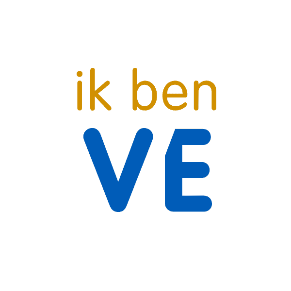
"I am VE-CO-ZO. Are you ZO too?"
– The recruitment concept
VECOZO is by and for healthcare and has existed since 2002. It is the national communications hub that handles the message traffic between all health insurers, care offices, local authorities and some 50,000 care providers. A major player, one you've probably never heard of, because VECOZO works behind the scenes of healthcare.
For the new careers website, Schwung developed the concept and the design. We didn't start with the technology, but took a step back: how do you make an unknown organisation appealing as an employer? The answer lay in the challenge itself.
Out of sight, out of mind, especially in an overheated market.
IT is at the heart of VECOZO, and that's exactly where the challenge lies. A relatively unknown healthcare organisation is fishing in the same overheated labour-market pond as large IT companies. Those IT specialists can take their pick of jobs, and their first encounter with VECOZO is usually a vacancy. Being unknown costs money: expensive external hires, knowledge walking out the door and projects running over. So the careers website had to show far more clearly that VECOZO is an attractive employer, for IT specialists and for staff, support and administration alike.
From challenge to concept.
Concept first, technology second
The brief was a new website. We first took a step back and developed a recruitment campaign concept based on the employer brand and the EVP. Make the organisation known to the audience and make the connection. Only then did the design follow.
- Discovery session with internal sounding board
- Employer brand and EVP as the foundation
- Concept before technology
I am VE-CO-ZO. Are you?
The solution lay in the challenge: an unknown name becomes the concept itself. Picture it: 'I am VE-CO-ZO!' And immediately turn the question back: 'Are you ZO too?' In the photography, the employees become the letters themselves, with large VE, CO and ZO letters throughout the real office.
- Name recognition and invitation in one
- Employees become the letters
- Photo shoot on location, our own people
Content first, but also branding
The site is built on the content-first principle. That's good for Google, but above all it forces a tight structure and sharp content. At the same time we kept the brand in view: in the sub-header we made room for imagery, so the site takes on the look and feel that suits VECOZO.
- Tight, findable structure (SEO)
- Room for imagery in the sub-header
- Work and brand: people come for both
Visual design & interaction
We translated the concept and structure into a visual design and interaction design, with advice on usability. A responsive site that's built to last, with dynamic content: vacancies, testimonials, figures and the atmosphere and culture of VECOZO.
- Visual design and interaction design
- Responsive and user-friendly
- Testimonials, figures and atmosphere
The people are the brand.
For the photography we literally brought the letters into the office. Our own employees pose with the large VE, CO and ZO letters, by the lockers, on the stairs, in the canteen. That's how the abstract message hub becomes a collection of recognisable faces. I am VE-CO-ZO.


We are VECOZO.
This is who we are. Who are you?
A concept that raises brand awareness and, in the same breath, puts the question to the audience. Not an anonymous IT employer, but a recognisable brand with a face of its own.
Concept and structure, together online.
The employer brand and the content-first structure come together in the careers website. Vacancies are built to last, the brand gets room in the imagery, and everywhere VECOZO introduces itself with the question back: are you ZO too?

About VECOZO · this is who we are
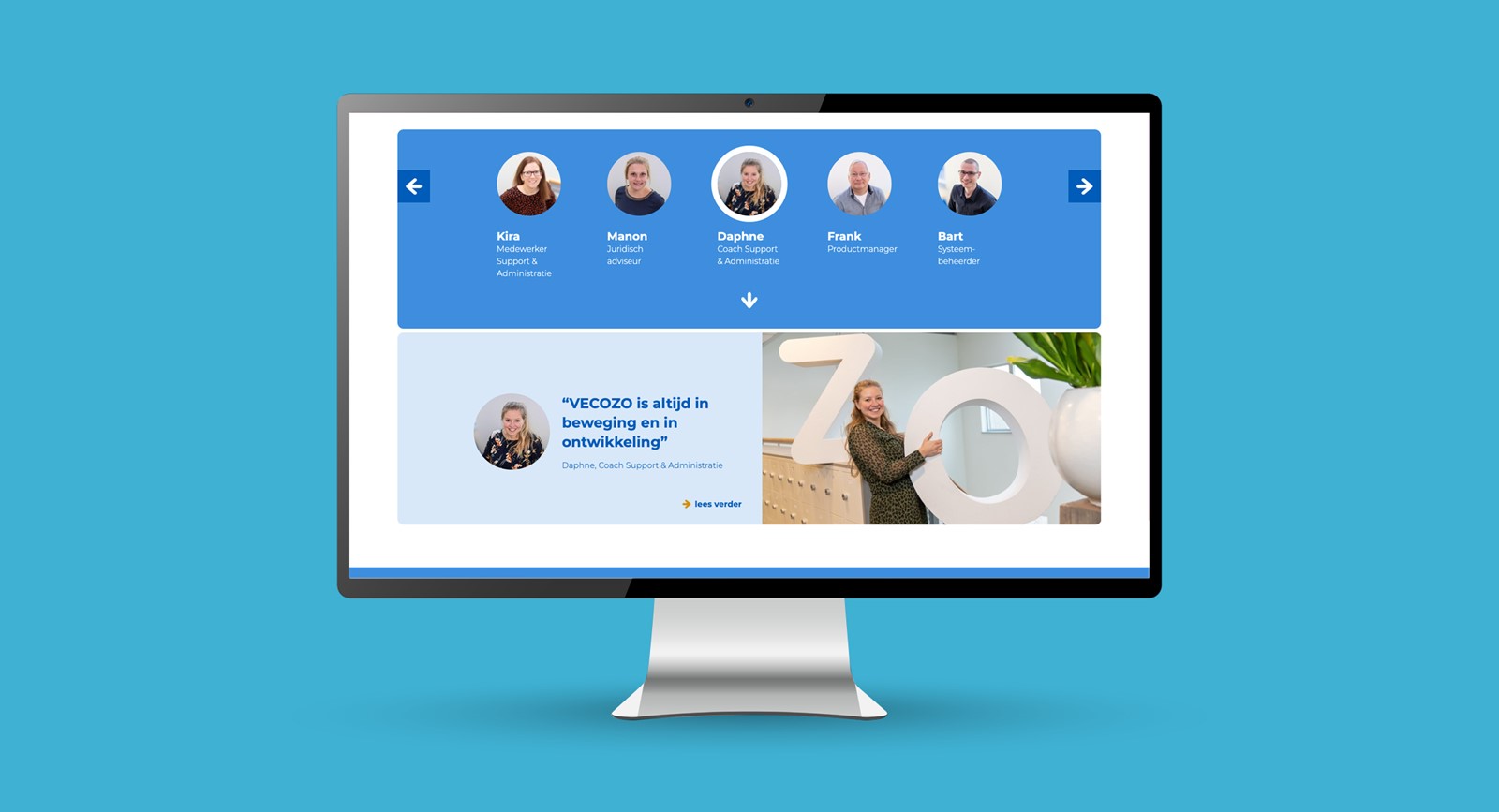
Our colleagues · testimonials
Role, client, live.
Frequently asked questions about the VECOZO case
What did Schwung do for VECOZO?
Schwung developed the recruitment concept and the design for VECOZO's new careers website. We didn't start with the technology, but took a step back to a strong campaign concept based on the employer brand and the EVP. We then handled the visual concept, the visual design, the interaction design and advice on usability. The website is built on the content-first principle, with room for the brand.
What is the concept 'I am VE-CO-ZO'?
VECOZO is a major, but unknown player: the company works behind the scenes of healthcare. The solution lay in that challenge itself: make your organisation known through your employer brand and connect with your audience. The concept introduces VECOZO and immediately turns the question back: 'I am VE-CO-ZO. Are you?' Employees become the letters themselves: in the photography they pose with large VE, CO and ZO letters throughout the office.
What was the challenge in the labour market?
VECOZO publishes around 40 vacancies a year and is mainly looking for professional IT specialists. They can take their pick of jobs, and VECOZO is fishing in the same overheated pond as large IT companies. A relatively unknown healthcare organisation has to stand out there. Being unknown led to expensive external hires, loss of knowledge and projects running over. The website needed to show far more clearly that VECOZO is an attractive employer.
What does 'content first, but also branding' mean?
The website is built on the content-first principle: the content takes centre stage. That's not only good for Google, it also forces a tight structure and sharp content. At the same time we kept the employer brand in view: by making room for imagery in the sub-header, the site takes on the look and feel that suits VECOZO. Because employees come for the work and the brand.
Who is VECOZO?
VECOZO is by and for healthcare and has existed since 2002. It is the national communications hub for the message traffic between all health insurers, care offices, local authorities and some 50,000 care providers. Billions of transactions a year run through VECOZO, along with the bulk of healthcare claims in the Netherlands. Invisible to most people, but indispensable to healthcare.
Will the next case be yours?
From employer brand and concept to a careers site that's built to last. We make your organisation visible as an attractive employer.